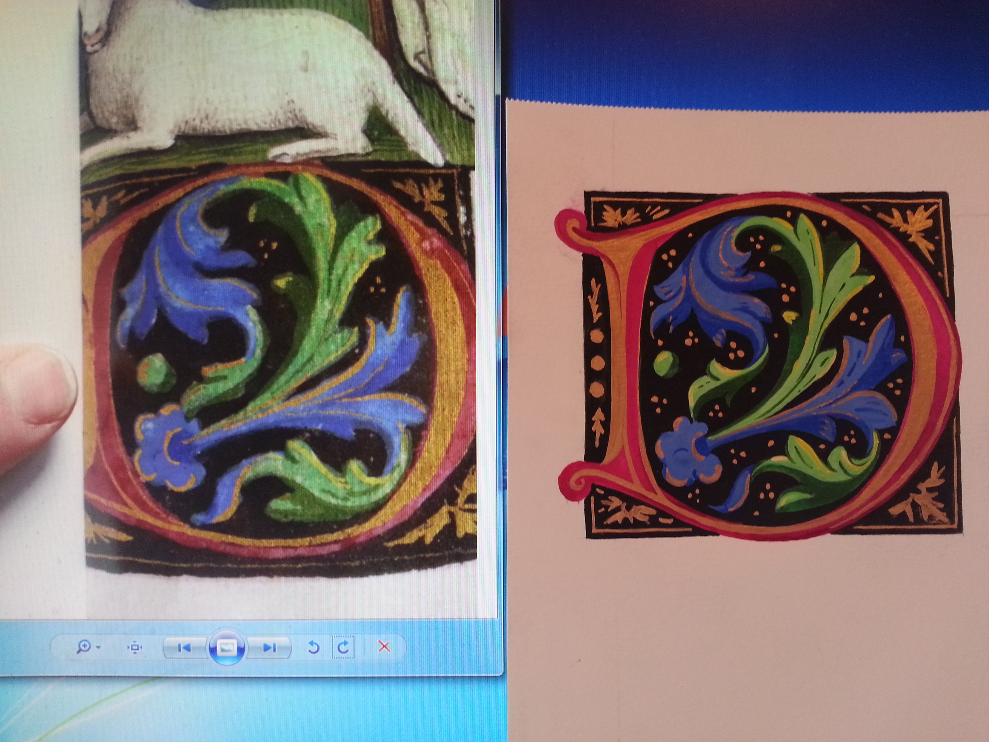
Aw, heck, I just liked this manuscript D. The one on the right is my interpretation, and in the process of making it, I found it finished before I knew it, and it really looked quite smart.
I have been asked in a number of occasions to give instruction. As much as I can prattle on about cards or perfume, I’m rather at a loss when it comes to articulating how I illustrate and illuminate. I’ll try.
1. a relaxed sketch with light lines, just enough to get proportions.
2. fill in rose, then green and blue.
3. fill in black, and outline as necessary. I didn’t need to in this example.
4. add gilding.
Because the black background will negate the need to outline if done carefully, and they seem to construct themselves. They present a lot of pop for the work.
Here’s an attempt to show what I’m doing. As I don’t have the exact same materials at the moment, it may go a little differently…
![20140918_134422[1]](https://ladyheatherhall.com/wp-content/uploads/2014/08/20140918_1344221.jpg)
light pencil sketch, followed with a gentle rub of kneadable tack
![20140918_134848[1]](https://ladyheatherhall.com/wp-content/uploads/2014/08/20140918_1348481.jpg)
Fill in red. I have mixed enough white for more of a rose color.
![20140918_140108[1]](https://ladyheatherhall.com/wp-content/uploads/2014/08/20140918_1401081.jpg)
Fill in blue.
![20140918_140922[1]](https://ladyheatherhall.com/wp-content/uploads/2014/08/20140918_1409221.jpg)
mixing for highlights and rose color.
![20140918_141435[1]](https://ladyheatherhall.com/wp-content/uploads/2014/08/20140918_1414351.jpg)
Fill in green and highlights.
![20140918_155856[1]](https://ladyheatherhall.com/wp-content/uploads/2014/08/20140918_1558561.jpg)
Fill in black. This is when I concentrate on details.
![20140918_171507[1]](https://ladyheatherhall.com/wp-content/uploads/2014/08/20140918_1715071.jpg)
gold detail.
![20140918_172027[1]](https://ladyheatherhall.com/wp-content/uploads/2014/08/20140918_1720271.jpg)
The complete scroll blank, and materials used. Finished within an hour.
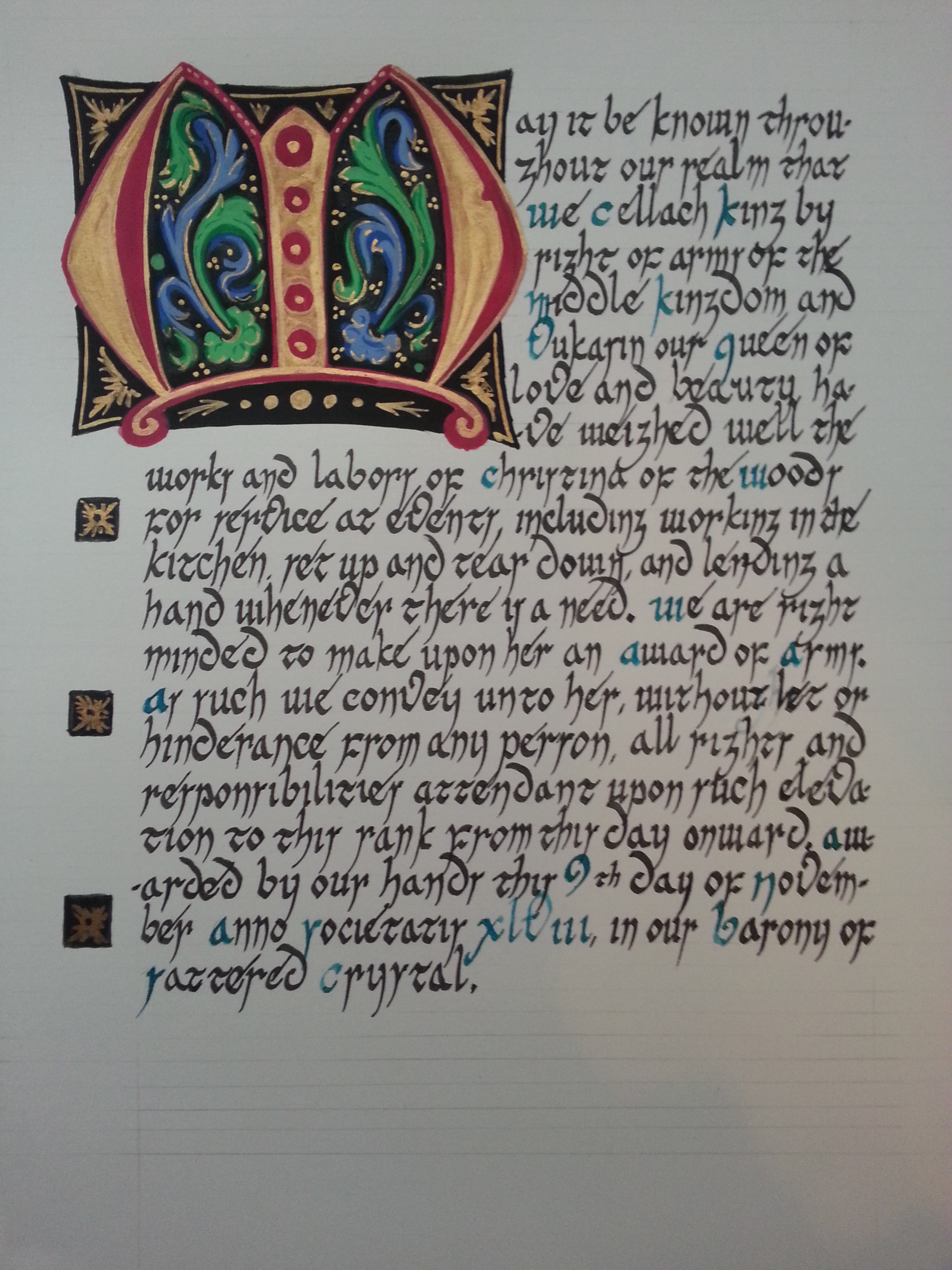
Yet another letter.